ifxAccordion 1.0 - Documentation
ifxDocs Main Page: ifxDocs | ifx Administrator: andrew.donald@rci.rogers.com
Description
An animated vertical scrolling accordion component. The ul-li structure is used to display content headers and upon clicking, the tab expands to display the full content. Typically used with "more" or "see full details" links. Included parameters allow full control of the appearance.
SPECIAL NOTES:
Each img tag included in the Accordion must be given a value for the height or width attribute. If no dimensions are passed in, the Accordion doesn't display properly in Chrome. Also, pass in a unique ID for each Accordion.
-
Live Demo
-
Example
-
Parameters
Key Data Type Values Description Select Params domID string $(this).attr("id") Fetches the ID of the unique accordion closedHeight integer 30*default Sets the height of the "closed" accordion (in pixels) px allowMultiple boolean false*default, true Allow for multiple rows to be open at the same time tabInitial integer null*default The integer specifies which tab should be open upon loading the Accordion. tabWidth integer $(this).parent().width() *default Width of the accordion. Accepts any integer in pixels px textOpen string "" *default Text shown below the down arrow. For example, "more", or "open" textClose string "" *default Text shown below the up arrow. For example, "less", or "close" imgOpen string "background-image:url('http://www.rogers.com/cms/images/en/Common/Icons/Arrow_Down.png'); height: 21px; width: 20px; padding: 0px !important; margin: 0px 5px 0 0!important;display:block;" *default The CSS for "open" or "more" button. The default is a down arrow. imgClose string "background-image:url('http://www.rogers.com/cms/images/en/Common/Icons/Arrow_Up.png'); height: 21px; width: 20px; padding: 0px !important; margin: 0px 5px 0 0!important;display:block;" *default The CSS for "close" or "less" button. The default is an up arrow. navPosition string "right"*default, "left" Indicate which side to place the controller (arrow and open/close text). Clicking the controller will open or close the tab. left right navWidthFull boolean true*default, false True: stretches the controller to the width of the tab.(Now, clicking anywhere in the visible area of the closed tab will open it and close it.)
False: Only clicking on the "span" containing the arrow image and open/close text will open and close the Accordion.tabEasing string "swing" *default Type of easing applied when opening or closing the tab. tabSpeed integer 500*default Indicates how fast (in milleseconds) the tab should open. Accepts any integer.
-
Code
<link media="screen" href="http://www.rogers.com/cms/ifx/css/ifx.css" type="text/css" rel="stylesheet"> <script type="text/javascript" language="javascript" src="http://www.rogers.com/cms/ifx/js/jquery.min.js"></script> <script type="text/javascript" language="javascript" src="http://www.rogers.com/cms/ifx/js/ifx.js"></script> <ul id="Accordion1" class="ifxAccordion" ifxAccordionParams=""> <li style="background-color:#CEE3F6"> <div class="myContent"> <div><h3 style="text-align: center; color: #26466D; margin-bottom: 5px; font-size: 13px;">Row 1</h3></div> <div class="col1"><img height="100" class="accordionImg" style="margin-left: 50px;" src="http://www.rogers.com/cms/ifx/ifxSliderAccordion/Examples/images/htc.jpg" border="0" /></div> <div class="col2">With the Sense&trade User Interface you can integrate your Facebook and Flickr contact lists with your phone's address book. Call, text or email your friends right from the address book, but before you do, view their updates from Facebook and Flickr so you'll have even more to talk about!</div> </div> </li> <li style="background-color: #CEE3F6"> <div class="myContent"> <div><h3 style="text-align: center; color: #26466D; margin-bottom: 5px; font-size: 13px;">Row 2</h3></div> <div class="col1"><img height="100" class="accordionImg" style="margin-left: 50px;" src="http://www.rogers.com/cms/ifx/ifxSliderAccordion/Examples/images/sony.jpg" border="0" /></div> <div class="col2"><p>1</p><p>1</p><p>1</p><p>1</p><p>1</p><p>1</p>With the Sense&trade User Interface you can integrate your Facebook and Flickr contact lists with your phone's address book. Call, text or email your friends right from the address book, but before you do, view their updates from Facebook and Flickr so you'll have even more to talk about!</div> </div> </li> <li style="background-color: #CEE3F6;"> <div class="myContent"> <div><h3 style="text-align: center; color: #26466D; margin-bottom: 5px; font-size: 13px;">Row 3</h3></div> <div class="col1"><img height="100" class="accordionImg" style="margin-left: 50px;" src="http://www.rogers.com/cms/ifx/ifxSliderAccordion/Examples/images/LG.jpg" border="0" /></div> <div class="col2">With the Sense&trade User Interface you can integrate your Facebook and Flickr contact lists with your phone's address book. Call, text or email your friends right from the address book, but before you do, view their updates from Facebook and Flickr so you'll have even more to talk about!</div> </div> </li> </ul>
Live References
-
11/21/2011 - andrew.donald@rci.rogers.com
- Modified code from ifxSliderAccordion
Versions
-
Row 1
 With the Sense&trade User Interface you can integrate your Facebook and Flickr contact lists with your phone's address book. Call, text or email your friends right from the address book, but before you do, view their updates from Facebook and Flickr so you'll have even more to talk about!
 -
Row 2
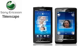
1
1
1
1
1
1
With the Sense&trade User Interface you can integrate your Facebook and Flickr contact lists with your phone's address book. Call, text or email your friends right from the address book, but before you do, view their updates from Facebook and Flickr so you'll have even more to talk about! -
Row 3
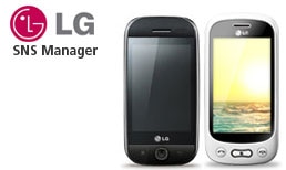 With the Sense&trade User Interface you can integrate your Facebook and Flickr contact lists with your phone's address book. Call, text or email your friends right from the address book, but before you do, view their updates from Facebook and Flickr so you'll have even more to talk about!